
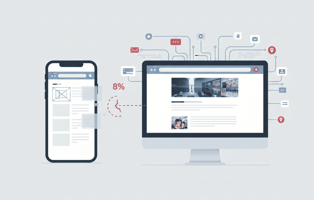
Mobile is now the first handshake for most visitors. It’s where ads click through, where links are shared, and where decisions get made while someone is walking to a meeting or scrolling on the couch. That’s why the headline finding from a recent cross-industry analysis should make every marketer pause: mobile landing pages are converting about 8% lower than desktop.
Eight percent might not sound dramatic at first glance. But if your team is squeezing lift from creative, bidding strategies, and audience targeting, an 8% conversion gap is the silent leak in the system. Let’s translate the headline into what it means for your funnel, why the gap persists, and what you can do—starting this week—to claw back those conversions without redesigning your entire site.
What the “8% gap” Actually Means (and How it Shows up in your Numbers)
When we talk about an 8% mobile gap, we’re describing a relative difference. If your desktop landing page converts at 5.0%, an 8% relative drop places mobile at roughly 4.6%. That’s 0.4 percentage points off the top. Doesn’t sound awful—until you multiply it across thousands of sessions.
Imagine 50,000 monthly mobile sessions. At 4.6% CVR, you net 2,300 conversions. Close the gap to match desktop’s 5.0% and you’d have 2,500 conversions—200 additional outcomes from the same traffic. If those outcomes are trials or qualified leads, your pipeline and paid efficiency both move meaningfully without an extra dollar of spend.
Why Mobile Underperforms (even when the Creative is Great)
Desktop layouts can hide sins that mobile ruthlessly exposes. Small screens magnify friction and bury clarity. If your site isn’t built with conversion-first design in mind, our mobile-friendly website development services can help you bridge that gap and boost performance. The usual culprits:
Page Speed and Stability
Mobile networks are spikier, devices are slower, and every heavy script or uncompressed image stretches load times. If the hero image and headline don’t stabilize in under a couple of seconds, your bounce rate rises before the value is visible. A big part of speed improvement comes from technical SEO optimization—minifying scripts, optimizing images, and reducing third-party tags that slow mobile load times.
Thumb-reach and Tap Targets
The call-to-action is often beautiful—and physically hard to reach. CTAs crammed near the top or small buttons packed together guarantee mis-taps and frustration.
Crowded Hero Messaging
Feature lists, sliders, and rotating banners bury the one thing a visitor needs: a crisp promise. If the value isn’t obvious at a glance, users scroll aimlessly or bounce.
Form Friction
Extra fields, mismatched keyboards (email vs number), and error messages that wipe inputs kill momentum. On a bus or while multitasking, no one fights a slow form.
Invisible trust
Social proof and guarantees end up below the fold or inside carousels. On mobile, you need short, visible proof near the decision point—right next to the CTA.
Measurement Gaps
Broken or incomplete mobile event tracking hides the real drop-off points. If you can’t see “CTA tap → form start → field error → submit,” you’re guessing.
A simple Operating System for Mobile: M.O.B.I.L.E.
Use this acronym to review any landing page in minutes:
M — Measure the First Impression
Time to first meaningful paint, layout stability, and how fast the headline becomes readable. Test on a mid-range phone over cellular, not your high-end device on Wi-Fi.
O — Outcome-first Hero
Lead with one outcome-based headline (10–12 words), one supporting line explaining how, and one primary CTA. Nothing else fights for attention above the fold.
B — Build for the Thumb
44px+ tap targets, generous spacing, and a sticky—but not competing—CTA on longer pages. Keep navigation minimal or hidden; your CTA is the north star.
I — Input Simplicity
Three to five fields max, with the right mobile keyboards, autofill, and gentle inline validation. If you need more info, use progressive disclosure after the first step.
L — Load only what Matters.
Compress media, lazy-load below-the-fold assets, defer non-critical scripts, and prune third-party tags that don’t earn their keep.
E — Evidence near Action.
Ratings, brief testimonials, logo bars, guarantees, or security badges placed immediately adjacent to the CTA—where decisions happen.
The above-the-fold blueprint (that doesn’t require a redesign)
- Tiny logo and minimal nav: You’re not selling your menu; you’re selling a next step.
- Outcome-driven headline: e.g., “Cut onboarding time by 43%—without extra developer hours.”
- One-sentence subhead: Clarify how: “Launch in minutes with templates and one-click integrations.”
- Primary CTA only: “Start free,” “Get my custom quote,” or “Book a 15-min demo.”
- Micro-proof: “4.8★ from 2,100+ users” or “Trusted by 5,000 teams.”
- Static visual: A crisp image, not an auto-playing video. Save motion for later.
Copy you can put to work today
- CTA labels that reduce risk: “Start free in 60 seconds,” “See it in action,” “Get pricing.”
- Micro-FAQ near the button: “No credit card required,” “Cancel anytime,” “SOC 2 & GDPR compliant.”
- Benefit bullets (three only): Each starts with a verb, each fits on one line, and none repeats the headline.
Patterns by Intent (Because not all Mobile Pages are the Same)
Lead Gen (B2B):
- Use a two-step form: email first, then role/company size if needed.
- Offer a low-friction alternative like “Email me the one-pager.”
- Add calendar booking on the confirmation step to turn momentum into meetings.
Ecommerce:
- Prioritize a single product or a tightly scoped offer instead of a catalog.
- Display price, shipping promise, and return policy above the fold.
- Test Apple/Google Pay on the landing flow; it cuts purchase friction dramatically.
Local Services:
- Make the CTA a phone button or a “Get instant quote” form with just three fields.
- Show service area, hours, and a 5-star snapshot next to the CTA.
- Add “Text me this link” for people switching devices.
Instrumentation: See the Journey, not just the Destination
Set up these events and you’ll know exactly where the mobile funnel leaks:
- First scroll (did they engage at all?)
- CTA tap (hero is pulling its weight)
- Form start (the handoff to input works)
- Field error types (what’s actually breaking)
- Submit (obviously)
- Success page view or server-side confirmation (to avoid client-side gaps)
Break those by device (iOS/Android), screen size buckets, and connection type (Wi-Fi/cellular). Add annotations when you run tests so you can connect lift to actual changes rather than seasonality.
Final Words
Mobile isn’t a smaller version of your desktop page. It’s a different environment with its own constraints and opportunities. The 8% gap is really a cluster of small frictions: a heavy image here, a vague headline there, a form field too many. Remove a few, place proof where decisions are made, and let the page breathe. You don’t need a ground-up redesign to earn back those lost conversions—you need clarity, reachability, and speed.
At RevoluteX Digital, we understand that every missed mobile conversion is a missed opportunity. Our professionals optimize mobile landing pages to bridge that 8% gap and turn visitors into loyal customers. With a combination of data-driven strategy, responsive design, and conversion-focused content, we help firms unlock their mobile potential and achieve measurable growth. When your audience lands from social ads, make sure your page matches the promise. Our social media marketing services help connect mobile users with consistent experiences that convert.
Whether you’re running Google Ads, SEO campaigns, or social media promotions, we have got you covered. We seek to ensure your mobile audience doesn’t just visit — they convert. Contact us today!
Ready to close your own 8% mobile gap? Contact RevoluteX Digital today to get a free mobile landing page review.

Jason
We are an Affordable Digital Marketing Agency in Shawnee with budget-friendly solutions to amplify your brand. Elevate your business without compromising quality or cost.