
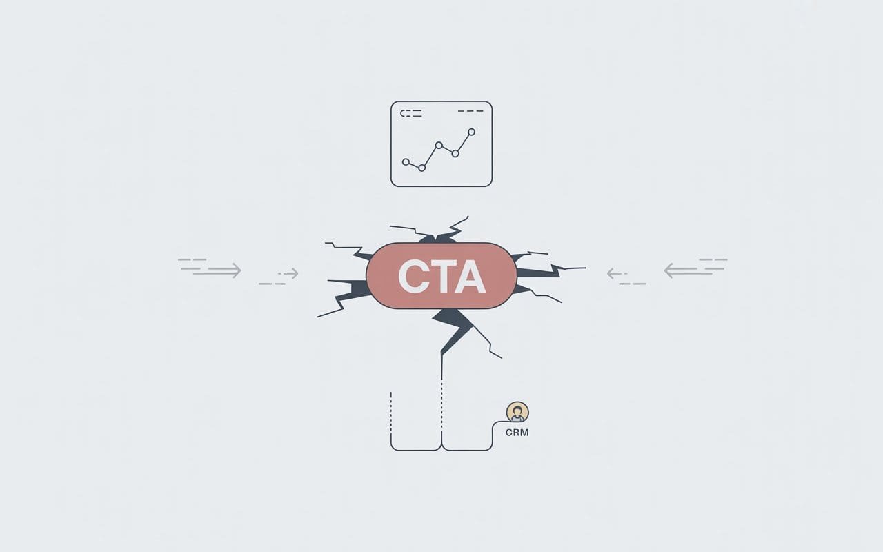
If your analytics say “good traffic” but your CRM says “where are the leads”, there is a high chance the problem is not your ads or your SEO. It is your call to action.
The CTA is the moment of truth. A visitor has read enough to be interested. Now they decide to move closer or walk away. If that moment is vague, stressful, or buried, your funnel leaks money every single day.
The 6 Deadly CTA Errors That Kill Conversions & How to Avoid Them
Let us walk through the biggest CTA mistakes and how to fix them with simple call-to-action optimization.
- Using Button Copy that Could be On Any Website
If your primary button says “Submit”, “Send”, or “Learn more”, you are asking people to act on blind trust. They do not know what they are getting, how long it takes, or why it is worth it.
Visitors hesitate when they cannot predict what will happen after the click. Hesitation kills conversions.
Fix it
Make the CTA describe the benefit, not the click.
- “Get My Free Audit”
- “See My Custom Plan”
- “Book a 15 Minute Call”
- “Improve My Conversions”
If the words on your button do not connect to the value of your offer, rewrite them.
- Asking for a Big Commitment from a Cold Visitor
You have seen this. First time on the site, the only CTA is “Schedule a 60-Minute Strategy Session” with a long form underneath. For someone who just met you, that feels like a trap, not an invitation.
You are treating strangers like warm leads. Most will bounce.
Fix it
Match the CTA to how much trust you have earned.
For cold blog readers.
- “Send Me the Checklist”
- “Get the Full Playbook by Email”
For people on service pages.
- “Check if We Are a Fit”
- “Get a No Pressure Quote”
For warm leads who already know you.
- “Plan My Campaign”
- “Start My Project”
A smaller first step is easier to say yes to. You can always invite them to a deeper conversation later.
- Hiding the Real CTA in a Mess of Choices
Many pages look like a wall of options. Demo, newsletter, ebook, chat, watch video, view pricing, plus three different “contact” links. When everything is loud, nothing is clear.
People are lazy in the best way. If the next step is not obvious, they do nothing.
Fix it
Choose one main action per page.
- Make that CTA visually dominant
- Repeat it a few times down the page in logical places
- Support it with a softer secondary option, not five equal options
For example, on a core offer page, your primary button might be “Improve My Conversions”, and a secondary link might say “See how our process works.” Design and copy should both point to the main action.
- Giving a CTA with Zero Context
A naked button at the end of a page feels like a cliff. No one wants to jump if they cannot see what is below.
When people do not know what happens after they click, they assume the worst. Long calls, pushy sales, spam.
Fix it
Add one or two lines of copy near the CTA that answer three questions.
- What do I get?
- How long does it take?
- Is there any pressure?
For example,
“Share your URL and top goal. In 24 hours, we will send a short video pointing out your biggest conversion leaks and what to fix first. No hard sell, just insight.”
Improve My Conversions
That tiny block of clarity can double your click-through rate.
- Ignoring Mobile when you Design CTAs
On a desktop, your CTA might look big and beautiful. On a phone, it might be squashed under an image, wrapped into three lines, or pushed far below the fold.
Most of your visitors are on mobile. If your call to action is hard to see or hard to tap, they will not fight your layout to become a lead.
Fix it
- Check every key page on a real phone, not just in a browser preview
- Make sure the main CTA is visible without scrolling too much
- Use thumb-friendly button sizes and spacing
- Keep CTA text short enough to stay clean on small screens
If the first visible button on mobile is a secondary action and your main CTA is buried, you have a design problem, not a traffic problem.
- Asking People to Act without Proving you are Worth it
A lot of pages drop a CTA and hope the visitor trusts them. No reviews near the button, no result numbers, no logos, nothing that says “other people did this and it worked out.”
You are asking for a step up with no evidence underneath.
Fix it
- Place a testimonial right next to your CTA, ideally from someone similar to your ideal client
- Add a short stat. “Average 32% uplift in conversion after 90 days”
- Include a simple trust line, such as “Trusted by 80+ service businesses.”
You do not need a huge case study besides the button. You need a tiny nudge that says, “This is safe, and it actually works.”
Conclusion
CTAs are small, but they decide whether your traffic turns into real opportunities or just noise in your analytics. A few focused call-to-action optimization changes can make the difference between “people visit” and “people buy.”
Revolute X Digital audits your pages, sharpens your offers, and rebuilds your CTAs so every key screen pushes visitors toward becoming paying clients. If you are ready to stop wasting clicks and improve My Conversions, our team can design and implement a conversion-focused funnel that finally pays you back for the traffic you already have.

Jason
We are an Affordable Digital Marketing Agency in Shawnee with budget-friendly solutions to amplify your brand. Elevate your business without compromising quality or cost.