
Within seconds of landing on your website, visitors initiate opinions about your brand, making a conversion-focused structure essential for transforming them into trustworthy clients. A high bounce rate and low conversion rate signal underlying design issues hindering your success, with the key being conversion science, not fleeting trends. Avoiding common website design mistakes is crucial to ensure your site engages users and drives meaningful action.
At Revolute X Digital, we craft contemporary, intuitive websites to transform clients into paying customers. Through strategic Website Development Service, we pinpoint and rectify prevalent website design flaws that erode credibility and hinder conversions. Refining elements like site layout, visual structure, and persuasive calls to action guarantees a fluid user experience that fuels sales and expansion.
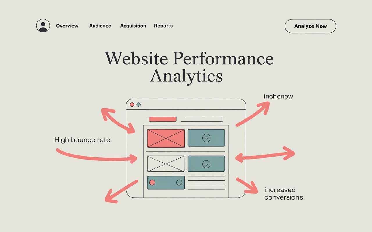
Let’s examine five of the most detrimental website design mistakes and explore practical solutions to convert website visitors into paying customers.

1. How Layout Clutter and Poor Visual Cues Kill Conversions
A cluttered website in which visitors are overwhelmed with an onslaught of elements, including exaggerated text and contents, competing illustrations, an array of buttons, and disruptive pop-ups that create chaos as each item demands attention. Therefore, this creates a connotation of disorientation, lacks straightforward priorities, and confuses the logical path a user takes through the content.
Characteristics of this mistake:
- Overwhelming amounts of text
- Excessive and competing Calls to Action (CTAs)
- Distracting visuals or animations
- Lack of a clear visual navigation path for users
The Downside for Conversion Rates:
Users typically scan web pages. If your design lacks a transparent hierarchy or overall transparency, users will struggle to comprehend the intended action, which is the leading cause of abandoning the site.
Solutions:
- Focus only on a single core message per page.
- Execute visual hierarchy through titles, color palettes, and spacing.
- Establish a straightforward content flow (Introduction → Advantages → Action).
- Utilize whitespace to minimize chaos.
Pro Tip: Use the “5-second test”. Ask someone to view your homepage for 5 seconds. Then, ask if they can identify what your business does and what their next step should be.
2. Weak, Uninspired, or Buried Calls to Action (CTAs)
One of the most frequent website design mistakes involves failing to guide users toward the desired action or next step.
Characteristics of this mistake:
- CTAs located far below the initially viewable area (“below the fold”)
- Generic button labels (e.g., “Click here,” “Submit”) that do not clarify the next steps
- Key website pages such as the homepage, product pages, and About Us page missing clear CTAs
The Hidden Cost to Your Conversions
Without clear direction, users become confused. Confusion leads to inaction, as visitors are more likely to leave the site.
Solutions:
- Use only action-oriented language: “Download Your Free Manual” .
- Position the primary CTA repeatedly at the end of the page.
- Make more CTAs visually distinct through the help of contrasting colors
A key Pro Tip: Limit each page to a primary CTA to avoid more stuffing and overwhelming visitors with too many choices..
3. Slow Page Load Speed
Website speed impacts trust and user experience. It’s one of the most underestimated website design factors.
Characteristics of this mistake:
- Large, uncompressed images
- Excessive scripts or animations
- Delayed interactivity after clicking
Negative Impact on Conversions:
- 53% of users abandon sites that are not user and mobile-friendly.
- If your pages take 1% of load time, it can decrease conversions by 7%.
Solutions:
- Compress images into the smallest size and use the WebP format for optimal outcomes.
- Minify CSS/JavaScript files.
- Implement lazy loading for images and videos.
- Opt for a dependable, high-speed hosting provider.
A key Pro Tip: Utilize Google PageSpeed Insights to identify areas for improvement in website performance.
4. A Subpar Mobile Experience
Most mobile browsing occurs in 2025 and beyond, so a mobile-first design has become the foremost. Treating the mobile experience as secondary is a significant misstep.
Characteristics of this mistake:
- Buttons that are way too small or placed too closely.
- Text that is too undersized to read conveniently on a phone
- Menus that do not work appropriately on touchscreens
Why Your Conversion Rate Is Slowing Down:
With mobile devices accounting for over 50% of web traffic, a poor mobile experience will frustrate users, leading to high bounce rates.
Solutions:
- Primary responsive design must be used to accommodate various screen sizes.
- Make sure that your text is readable without zooming.
- Focus only on Optimize CTA buttons for more friendly user-interaction.
- Simplify menus and lower the number of steps required to navigate.
A Key Pro Tip: Use the approach Google’s Mobile-Friendly Test to evaluate your website’s mobile usability.
5. Design That Makes Visitors Question What’s Next
First impressions matter significantly as it lasts. An obsolete, unskilled, or confusing website can erode user confidence and credibility.
Characteristics of this mistake:
- Old-fashioned fonts, color schemes, or design trends
- Broken links or pixelated pictures
- Lack of SSL encryption
- Absence of testimonials, considerations, or trust indicators
Negative Effects on Website Conversions:
A lack of professionalism creates doubt, which can destroy more conversions. Clients need to authorize your business objectives before providing any personal information.
Solutions:
- Incorporate contemporary layout elements and sustain consistent branding.
- Include trust signals, such as:
- SSL certificate
- Client testimonials with photos
- Google review badges
- Partner logos or certifications
- You should regularly update content to show an active business.
A key Tip: For high traffic, humanize your brand by including pictures of your dedicated team, real clients, or behind-the-scenes glances.

Jason
We are an Affordable Digital Marketing Agency in Shawnee with budget-friendly solutions to amplify your brand. Elevate your business without compromising quality or cost.